Vaxine
An intuitive experience for elderly NY residents scheduling vaccine appointments.
overview
This was a 3-day online Hackathon competition hosted by General Assembly to challenge designers and engineers to create a solution related to remote healthcare access and present to a panel of judges.
My team placed 2nd out of 8 teams with our product Vaxine, an app to help individuals schedule vaccine appointments at their convenience.
UX/UI Designers: Amelia Holt, Jackie Alejandro, Megan Kwon
Software Engineers: James Nascimento, Samantha Goldstein, Marjorie Hurtado
Team Role:
UX/UI Designer
Duration:
3 days
Tools Used:
Figma, Zoom, React
design prompt:
how might we make healthcare more accessible in a remote world?
research and discovery
Choosing the right problem, research…and more research
Nowadays, COVID-19 Vaccinations are a hot topic and are uncovering flaws within our public health system and healthcare accessibility. With this prompt in mind, my team and I wanted to focus on the current issues people are experiencing when scheduling vaccinations once deemed eligible. Due to our time constraints, we narrowed the scope of our project to a major US metropolitan area, New York City.
In a major city like New York, vaccine appointments are extremely limited and difficult to schedule. According to the state’s government website, vaccines are available at pharmacies, hospitals, and through local health departments statewide.
we asked ourselves, what is NY’s current vaccination plan and most importantly…who is eligible?
With limited weekly distribution of vaccines, the city of New York only has the vaccine accessible to two groups:
phase 1A
includes healthcare workers and residents and staff living in certain group living communities
phase 1B
includes residents 65 years and older, first responders, school faculty/staff, and essential workers
Discovering real people experiencing real issues
After learning about NY’s current vaccination progress, we took the time to interview healthcare professionals, a NY resident who recently was vaccinated, and others that underwent the process of scheduling and receiving the vaccine.
In those interviews, we discovered that many who are eligible have not been able to acquire information to make an appointment other than knowing that they are eligible.
Identifying our user and MVP
After hearing great insights from our user interviews, we decided to focus on Phase 1b, which is the 65 + years and older group. We noticed through our research, people 65+ were struggling to find appointments online or received help from family members that helped them through the process.
Then we began to think about those, who did NOT have the privilege of having someone else assist them during the appointment process. What is the process like for them?
What is New York’s current vaccine registration platforms?
As the vaccine is slowly becoming more available, the more limited the vaccines become.
Currently there are three platforms where New Yorkers can register to get an appointment (NY government site / NYC Health & Hospitals / NYC Health).
However, we uncovered some issues with some of these platforms such as having a very long application process, in addition to no real time of knowing if vaccines are available within the locations provided.
Understanding the process through the eyes of our users
This is the NYC Health & Hospitals homepage, one of the methods a NY resident can schedule an appointment.
From first glance, the information presented was considered to be overwhelming for our user and we were immediately presented with growth opportunities to prioritize vaccination appointments for their users.
The buttons one could use to proceed with making an appointment also presented an issue for our phase 1B users. They are fairly small accompanied with text, making it difficult to read. In addition, the verbiage on each button is very similar and could result in confusion.
When you click on one of the buttons, you are redirected to the application form. For our phase 1B user, this application process is very demanding and lengthy because the questions appear one at a time, rather than all at once with no clear indicator of how long the process is.
The key takeaways we got from our research were:
The current process to schedule an appointment is inefficient and confusing especially those in Phase 1b
The information presented is extremely content heavy and lacked inclusion for our NY residents 65 years or older
design
Rapid prototyping and collaborating to create a purposeful design
With our experience with New York’s current scheduling process and the difficulties presented for our user, both the designers and engineers brainstormed this statement:
how might we improve the process and accessibility for our user?
Our must haves for our design as a team included:
Being transparent about the scheduling process
Minimizing content to prevent content overload
Legibility for better clarification
Accessibility
Handing off our design
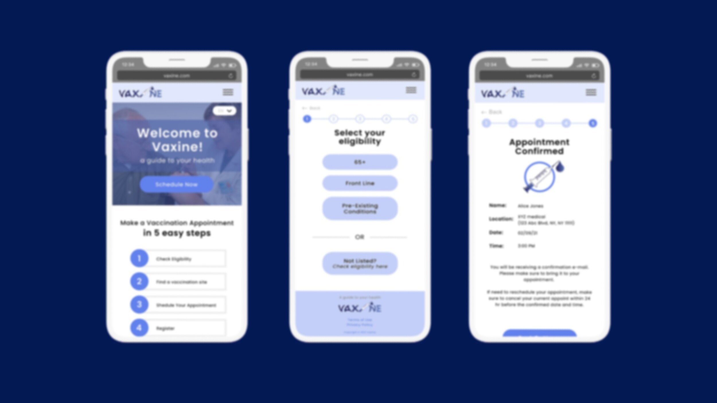
After rapid prototyping and user testing, we presented to our engineers our hi-fidelity prototype for Vaxine, a responsive website that acts as a guide to those eligible, to schedule a vaccine appointment at their convenience.
Compared to what New York currently provides for scheduling, we wanted to offer an alternative solution built on accessibility and efficiency for our user (Phase 1b ages 65 and over). We chose to do a responsive site so that our user can access Vaxine on a multitude of devices, rather than limit them to one.
reflection
Finding a balance between designing and deploying
Due to our limited time constraint, I was in constant communication with our team of engineers to create a product that feasible in both design and development. This project was a great opportunity to work closely with engineers and to involve another team in the design process.
Here’s our live demo of Vaxine that our engineers were able to complete!
Through this experience, I learned how to effectively communicate my ideas and design concepts to developers and how to prioritize our MVPs with a limited time frame.


